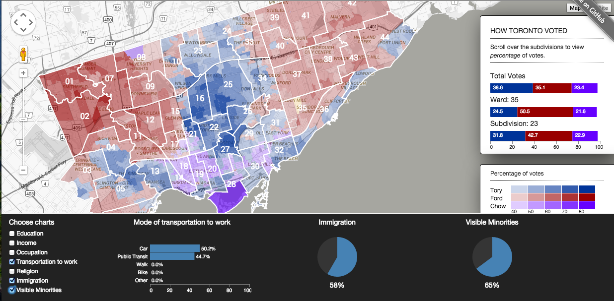
Election maps are hot, but this one shows what happened in a lot more detail. Web developer and designer Pete Smaluck and policy analyst Tom Weatherburn have developed a map that disaggregates ward results in Toronto down to the neighbourhood level. The map allows the user to scan subdivisions based on three key characteristics at a time (from education, income, occupation, transportation to work, religion, immigration, and visible minorities) to see the percentage of votes John Tory, Doug Ford, and Olivia Chow got in last month’s election. The map shows a much more nuanced picture than the “divided Toronto” we’re always hearing about.
Here’s what the map and analytics look like if you choose mode of transportation taken to work, immigration, and visible minorities–hover over the riding to see the trends broken down by neighbourhood.

