A couple of years ago, when I attended the Association of Collegiate Schools of Planning annual conference in Chicago, I was stunned to hear that Cleveland and Chicago are the most segregated cities in the US. As I’ve written before, Canadian cities simply don’t have these levels of segregation; obviously not for African American and Hispanic populations, but also not for other groups. Recently, I’ve come across a series of maps illustrating the difference between American cities that are more segregated vs. more integrated, thanks to some enlightened cartographers. It is very interesting to compare these maps to the (albeit simpler) maps of visible minorities in Canadian cities recently published by the Globe and Mail.
Bill Rankin‘s map of Chicago illustrates the sharp divides between white, black, Asian, Hispanic, and other ethnocultural groups. It was originally published in Perspecta, the journal of the Yale School of Architecture; Rankin is a PhD candidate in architecture and the history of science.
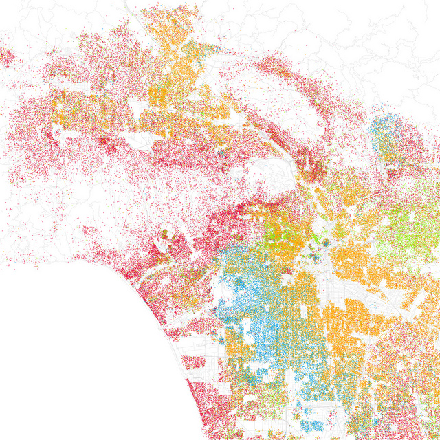
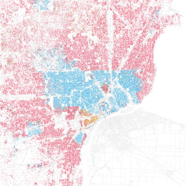
After seeing this, Eric Fischer produced similar maps for the 40 largest American cities. He used the same process as Rankin (one dot for every 25 people and same colour code, using the 2000 Census data).
We can see some segregation in New York City, but there are zones of integration.

Detroit’s 8-Mile district stands out as an example of entrenched segregation. Many of the maps of smaller cities, like Buffalo, Toledo, and Raleigh, highlight inner city concentrations of African Americans.

On the other hand, check out Riverside, CA, which looks very integrated. Los Angeles also has a lot of integration, and San Antonio is very integrated.

A couple of weeks ago, the Globe and Mail posted a series of “heat maps” showing the concentration of visible minorities in Canadian cities. They don’t break down the statistics (from the 2006 Census) into specific ethnocultural groups, as is the usual Canadian trend; there are simply too many groups to map. But they are interesting nonetheless. The maps are interactive, allowing you to zoom in, so I can’t reproduce them here. Check them out at www.globeandmail.ca under Multiculturalism.
Vancouver’s map shows that in most census tracts in Vancouver, Burnaby, Richmond and Surrey, over 30% of the population are visible minorities. Toronto has a similar pattern: over 30% of the population in Toronto, Brampton, Mississauga, Richmond, and Ajax are visible minorities. The central Toronto map shows some interesting areas of lower concentration: areas around the subway lines, west Toronto and the Beaches. In Calgary, Winnipeg and Ottawa, the census tracts with over 30% visible minorities are mainly in the suburbs.
Montréal is even more fascinating because it shows a very different pattern. The visible minority population there is almost exclusively concentrated on the island of Montréal, with lower rates of concentration in the suburbs: the older pattern of immigrant settlement that we still see in smaller cities. This is likely due to sheer numbers: Toronto and Vancouver receive tens of thousands more immigrants each year than Montréal.
Obviously, the American maps show that not all cities south of the border are sharply segregated, but even in the smaller cities, like Toledo, Ohio, there are lingering segregated African American populations. This in itself is not an issue; the maps of Canadian cities show lots of neighbourhoods with high concentrations of visible minorities. The real issue is when these concentrations are due to poverty or discrimination (either societal or institutional, such as in the housing market). American housing research seems to indicate that much of the segregation is in fact due to these two factors. Entire programs are devoted to fixing this problem: Housing Choice Vouchers, for example, aim to remove people from entrenched areas of poverty into neighbourhoods where they may have better educational and job opportunities.
I think these maps illustrate again how different Canadian and American cities are in terms of ethnocultural groups: both in terms of their composition and their spatial dispersal. This continues to create policy differences between the US and Canada, not only in my own research areas of housing, transportation, and immigration, but in many other areas affecting municipalities: welfare provision, health care, and education to name a few.

