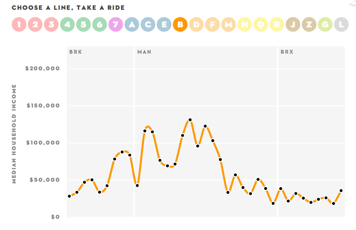
The New Yorker has published a fascinating subway infographic showing the change in median household income along each of its subway lines. The interactive inequity-subway line graph highlights the growing income inequality between Manhattan and the other boroughs (see screen capture below). Oh, the joys of free and open Census data!

I’d love to see similar maps for other cities in the world. We know that income inequality has been increasing in Canadian cities. Transit geeks, assemble! Show us Toronto, Tokyo, London, or Paris, and smaller cities as well. And it would be really fascinating to see how BRTs and LRTs fare in this analysis.

Dear Dr Thomas,
Here is one for Paris:http://dataparis.io/# post from the blog where I found this info (there is a comment by lagatta) http://anyportinastorm.proboards.com/index.cgi?action=display&board=paris&thread=6628&page=1#170897
I’d love to find one for Montréal. There would be the west-east spread common in many cities (New York is something of an exception because Manhattan, at least, is so north-south) but also pockets of poverty and enclaves of relative wealth. My neighbourhood near the Jean-Talon Market has experienced significant gentrification. I’m glad I’m in a housing co-operative!
I think such a study in Amsterdam would require looking at tramlines as well as subways, which have such a limited coverage there and are rather strange in a city on stilts…